
Lagos: In Defence of Colour, Pattern and Why Your Home Should Reflect Who You Are.
Colour isn’t a brave choice, it’s a birthright.
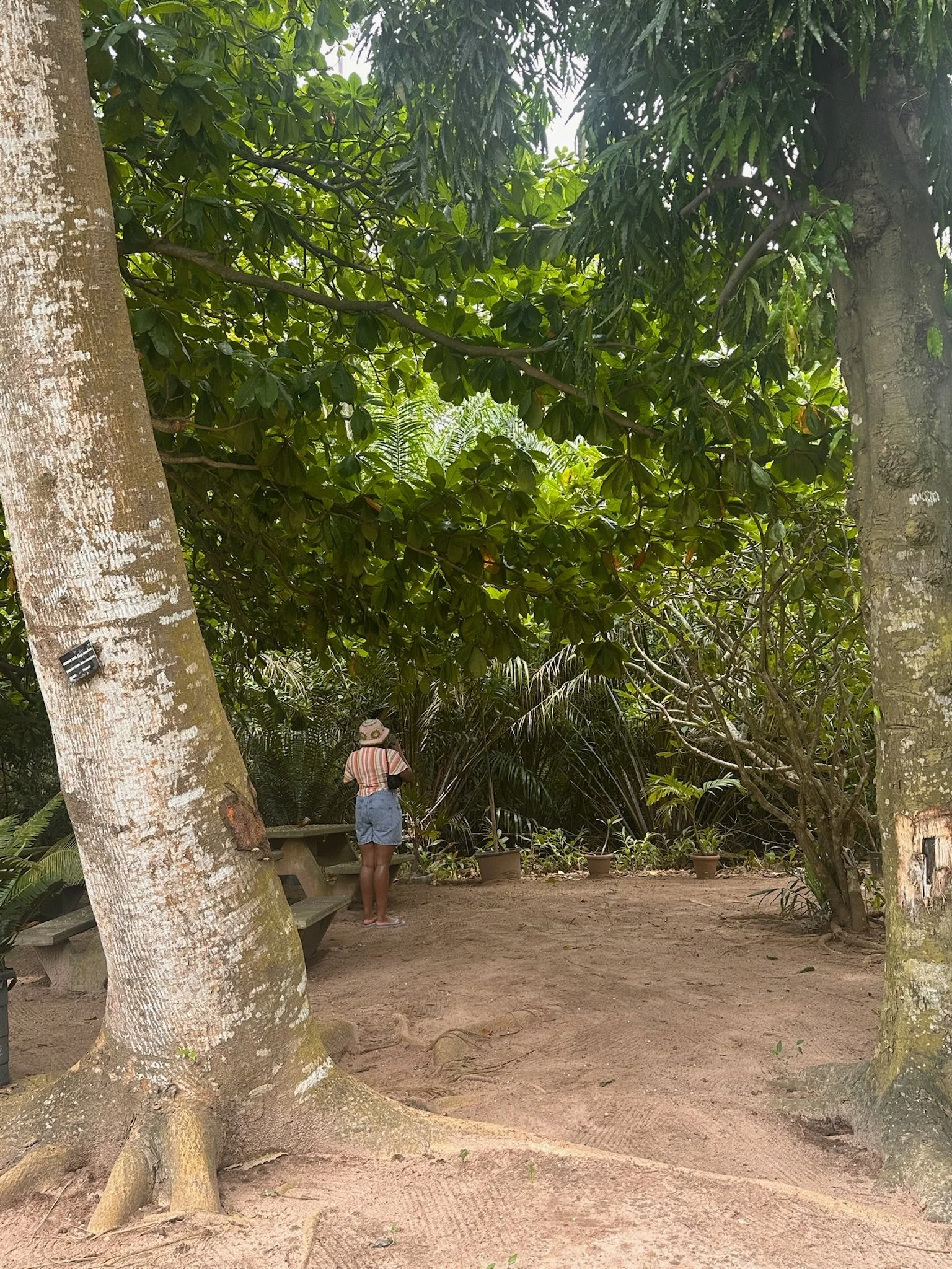
Aaliyah at Lekki Conservation Centre
I’m Nigerian, Yoruba to be precise but have lived in London most of my life. I studied interior design in Edinburgh and my working career has been in London.
In contemporary interiors it’s very easy to be drawn to minimalism. There's this idea that stripped back spaces equal refinement, restraint and wealth. As if maximalism is somehow less considered and not ‘good design’.
This is something that even as a designer I struggle with sometimes, when you are scheming and pulling fabrics together you can feel like maybe this is a bit too much? Will this feel too busy, would a plainer weave work better rather an a bolder pattern and print? Of course, there is time and place for both. But today I’m writing this in defence of colour! Colour and pattern really matter!
Lagos
This post might feel very diaspora kid and I apologise in advance. I was in Lagos recently, travelling between the mainland and the island. I did what I do best, window shopping and mooching around. I went to big department shops like Orca to artinsal markets and galleries like Lekki Arts and Craft Centre, Toro Market and the Nike Art Gallery.
It very quickly became very clear that there was colour. Everywhere. Unavoidable. Completely unselfconscious.
With my Mum haggling on my behalf and getting me the ‘best price’ I perused markets like Balogun market and looked at the beautiful adire dresses and Ankara bags. Painted walls in combinations you might be hesitant to pick. A pink arch against a dark wooden door, mustard yellow with forest green, terracotta and cobalt on the side of homes.
What Lagos reminded me of.
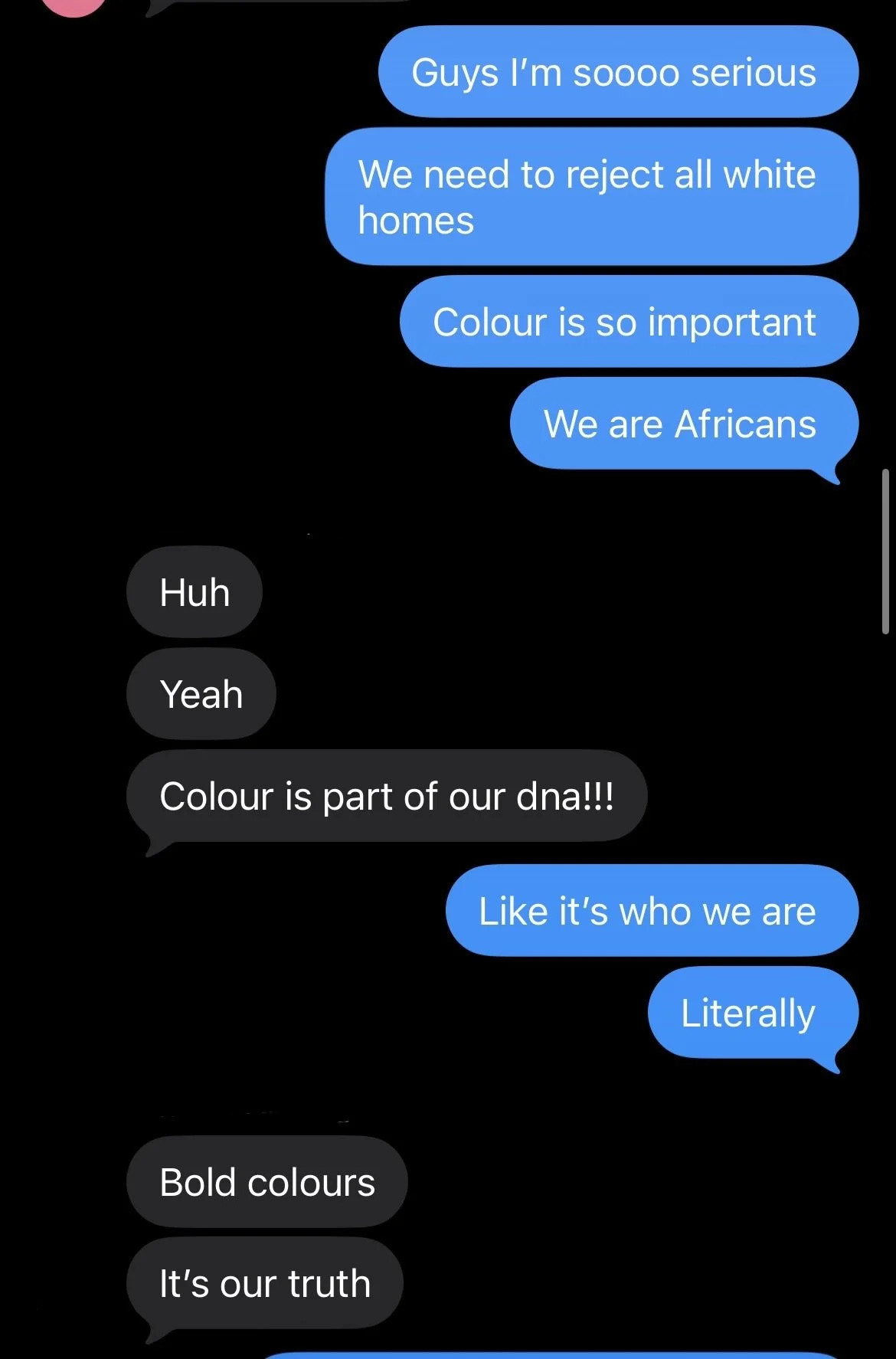
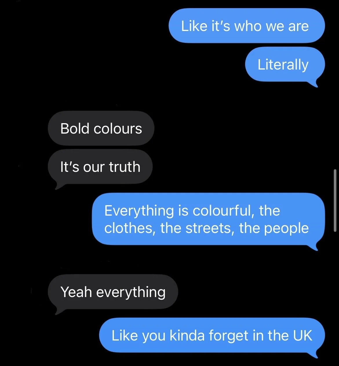
I stayed with family, I visited friends and what stood out to me the most was the sheer amount of colour, bright patterns, fabrics and motifs throughout. I’ve attached a text exchange I had with my friend below showing how I felt in the moment. Africa is colourful. We are Africans, we are colourful people, drawn to colour. We are bold, we are loud, we are fun and this shows within both the interior space and the fashion space which I feel are very intertwined.
This trip was a reminder that colour, pattern, motif and visual interest are foundational. Not decorative afterthoughts. Not brave choices. Foundational.
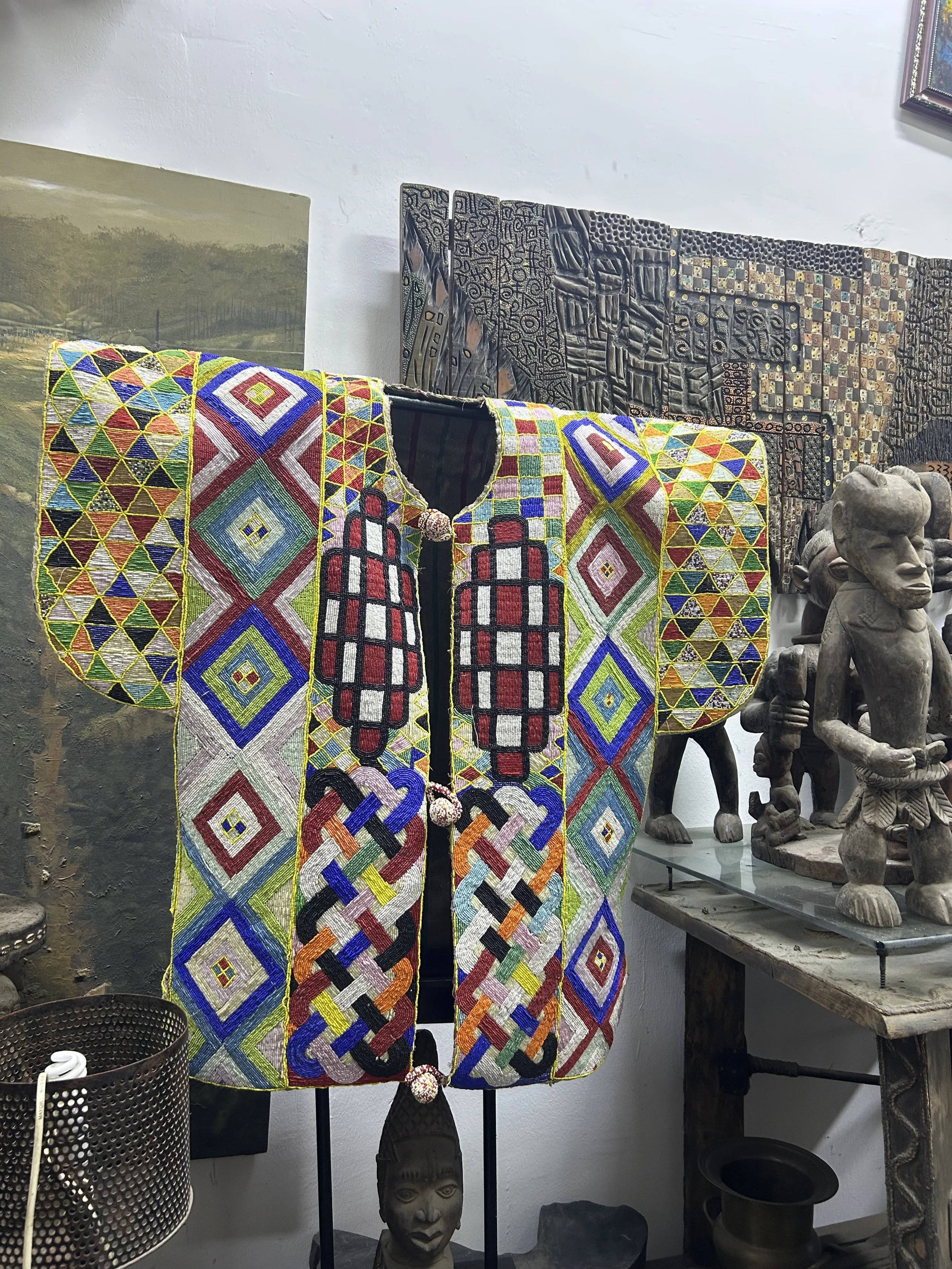
Nigeria is full of amazing artist and artisan and I’m so proud to come from a people who are so creative a trait that I feel like has followed me and carried me this trip. I found it very inspirational and I found it to be to really challenge me as a designer.
As a designer it genuinely challenged me. It made me reconsider combinations I might have talked myself out of at the scheming stage. Here are some that stopped me completely:
Pink arch and drag green wall
Pink against dark wood, mustard against forest green, the kind of pairing you'd hesitate over on a mood board, but here it just works.
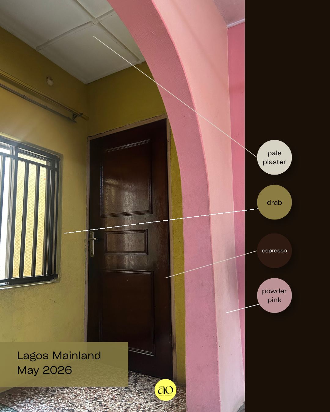
This was one the first colour schemes that I really adored. Actually in my grandmas house! Drab, espresso and powder pink in particular are three colours you wouldn’t necessarily think of together. However, something about this really works and the pale plaster on the ceiling cuts through what could have felt very busy.
Dusty lilac, pale plaster and slate blue
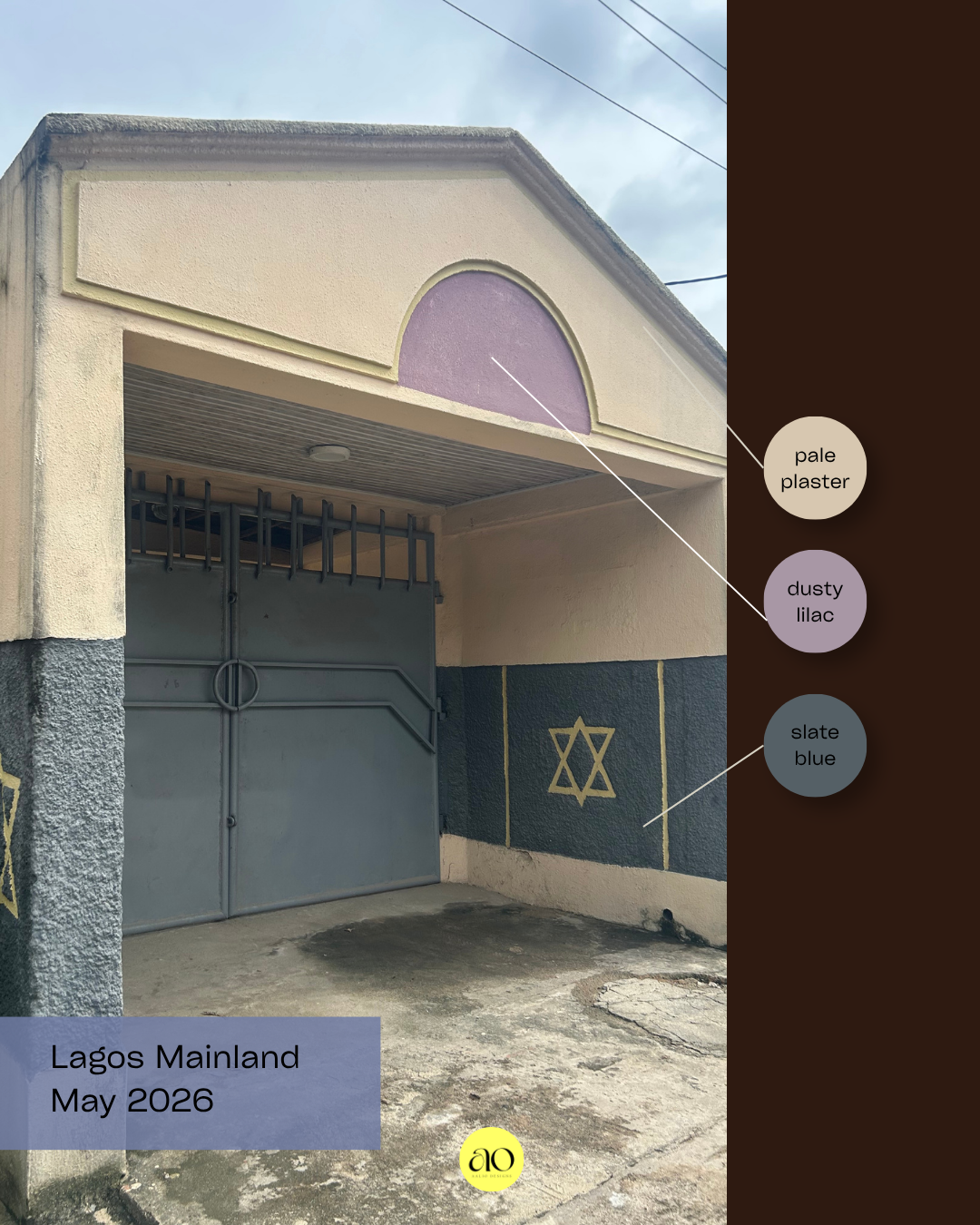
Spotted on the side of a building on the mainland. This combination feels so soft and powdery. Although the colours are bold they are somewhat desaturated, making them less intense.
Warm sand, old brass and army green
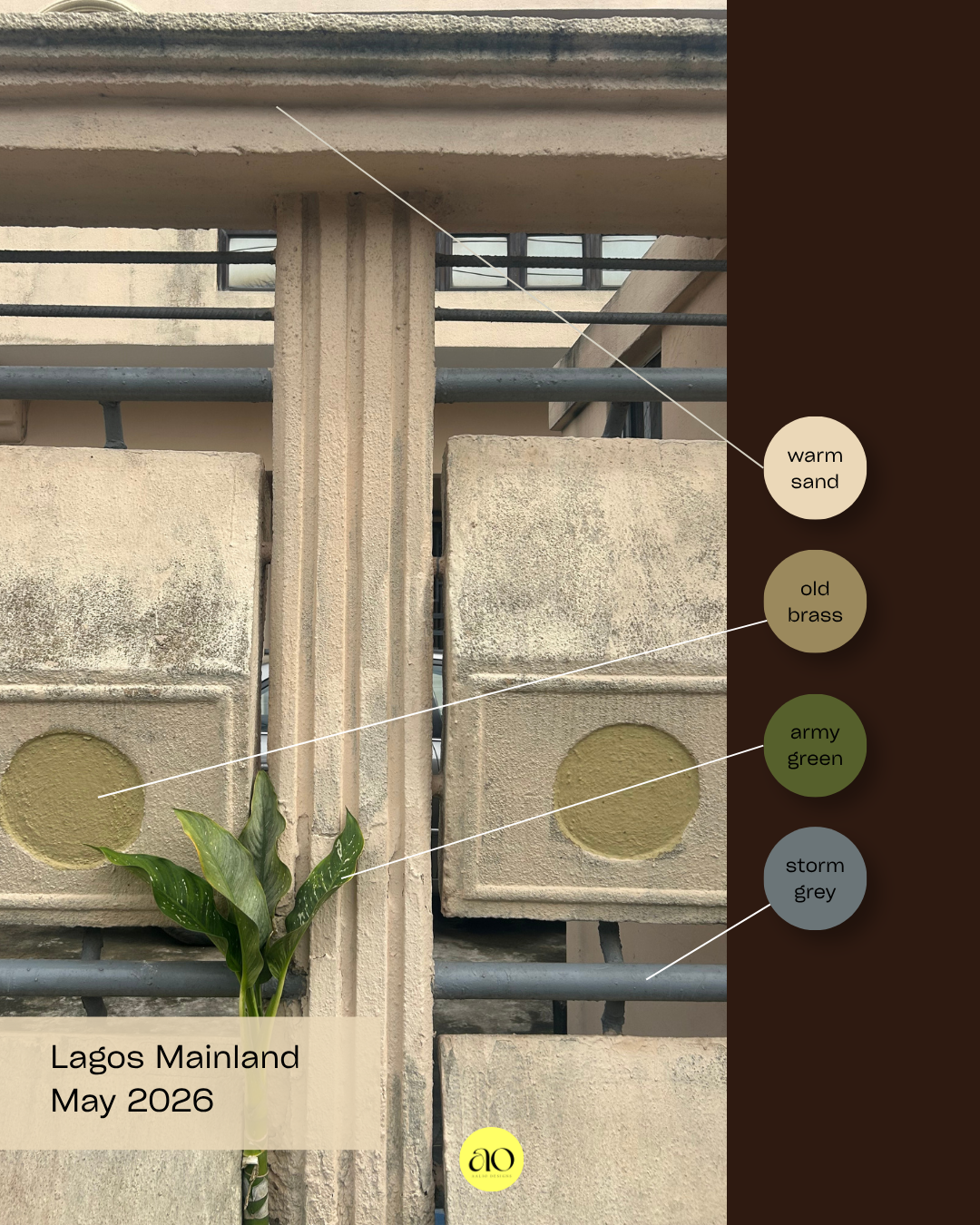
For me these colours together feel incredibly serene. The warm sand and old brass totally feel very tonally similar, the army green adds just a bit of freshness. The storm grey in the mix in the ironmongery stops everything feeling too warm, it’s the unexpected bit of coolness that livens up the overall palette.
Indigo, slate blue, pale sulphur and claret
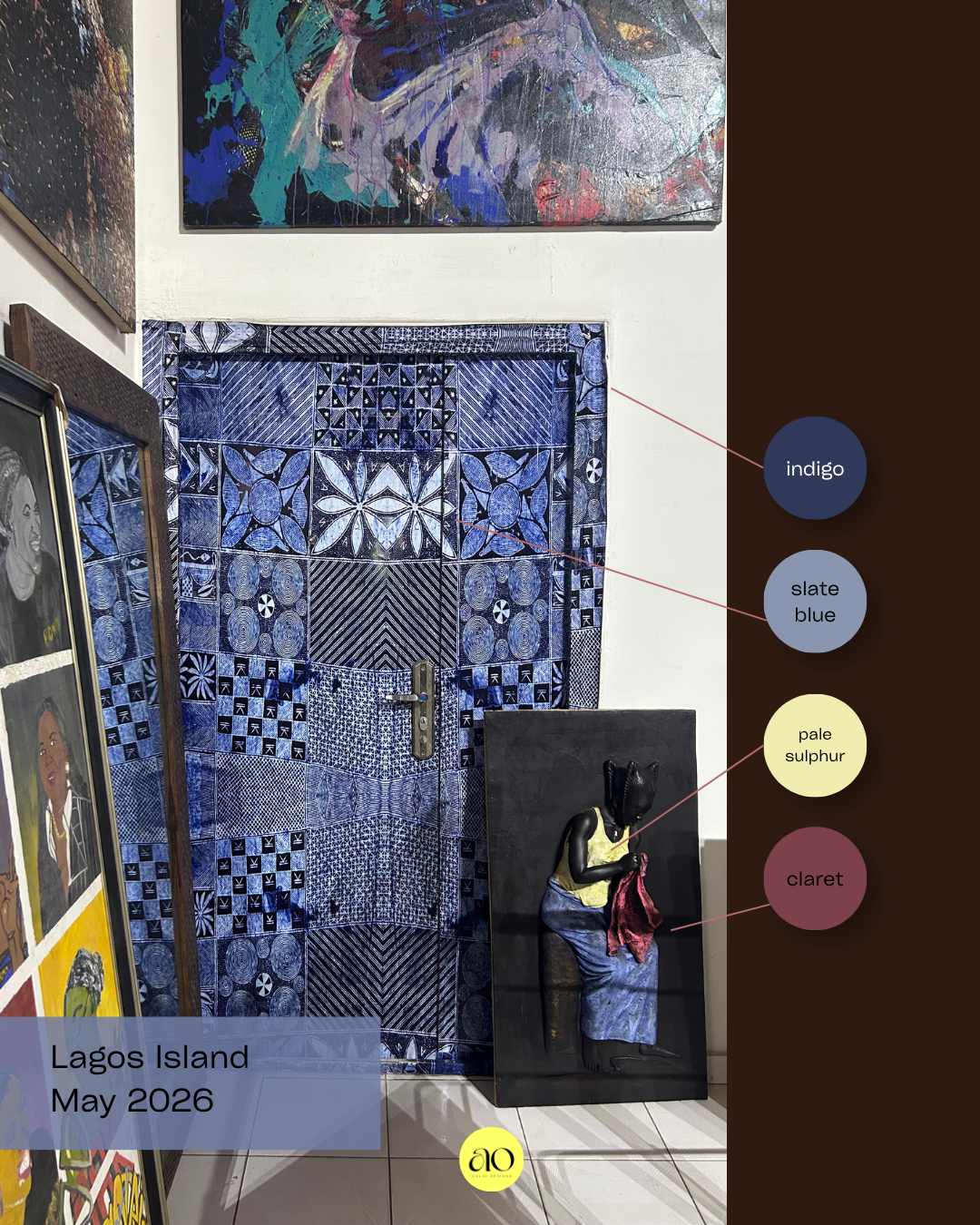
This image is from the Nike Art Gallery, a space I couldn’t recommend enough. The painted adire style door and architrave is so fun. It really punctuates the space with indigo and slate blue. Indigo and pale sulphur is a classical combination that works great here. The addition of the claret in the artwork adds just a tiny bit of warmth. The colours all coming together feels very contemporary and romantic.
Deep lilac, lavender, dijon and warm cream
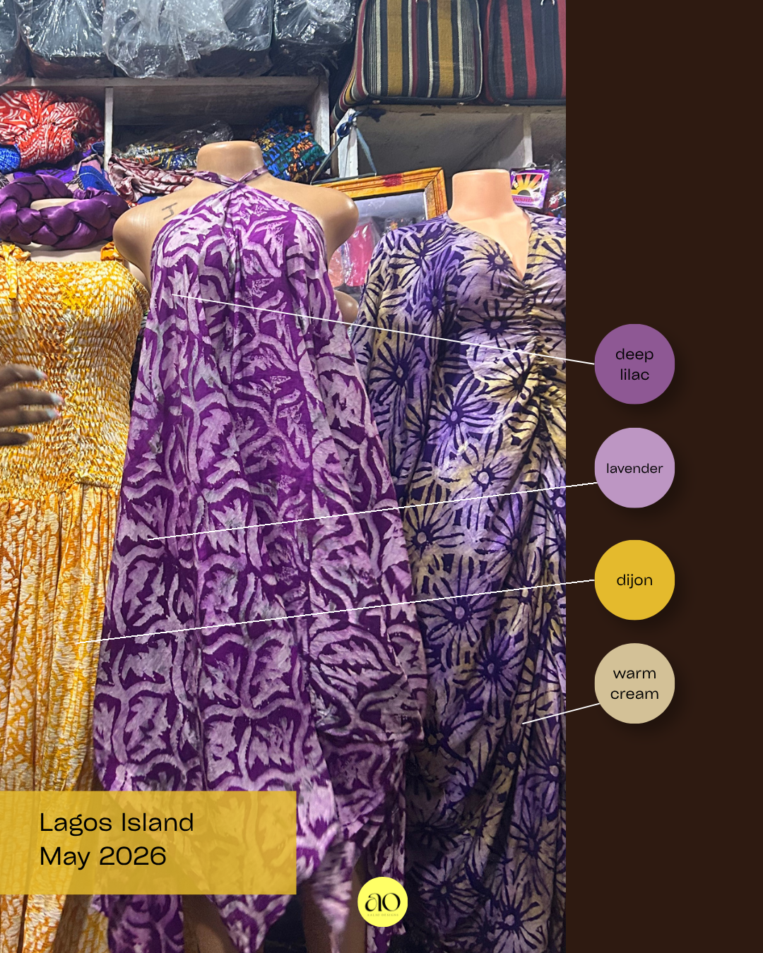
This is from when I went to the Lekki Arts Centre. It’s an indoor/outdoor market filled to the brim with clothes, accessories, artwork, everything you can think of made and sold by artisans. The first two dark dresses are shades of purples and the third has a pop of dijon Purple and yellow is a classic complementary colour pairing. This however, felt a lot less graphic as the purples aren’t matching and the yellow felt quite muted.
Cobalt, raw umber, malachite and chalk
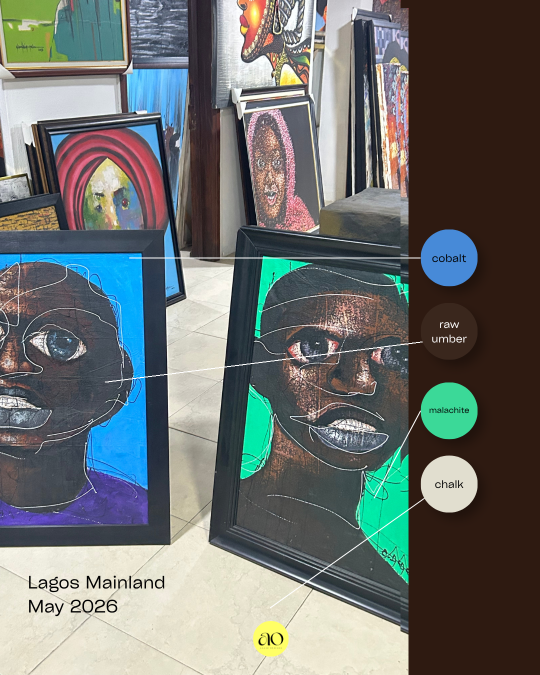
At Toro Art Gallery I was shown loads of amazing artwork. I found this in particular to be so striking and high contrast. The boldness of the malachite next to the cobalt without a mediating tone should feel aggressive. It didn’t for me, it felt energising, celebratory and a reminder that colour doesn’t always need softening.
Plum, mustard, teal and crimson
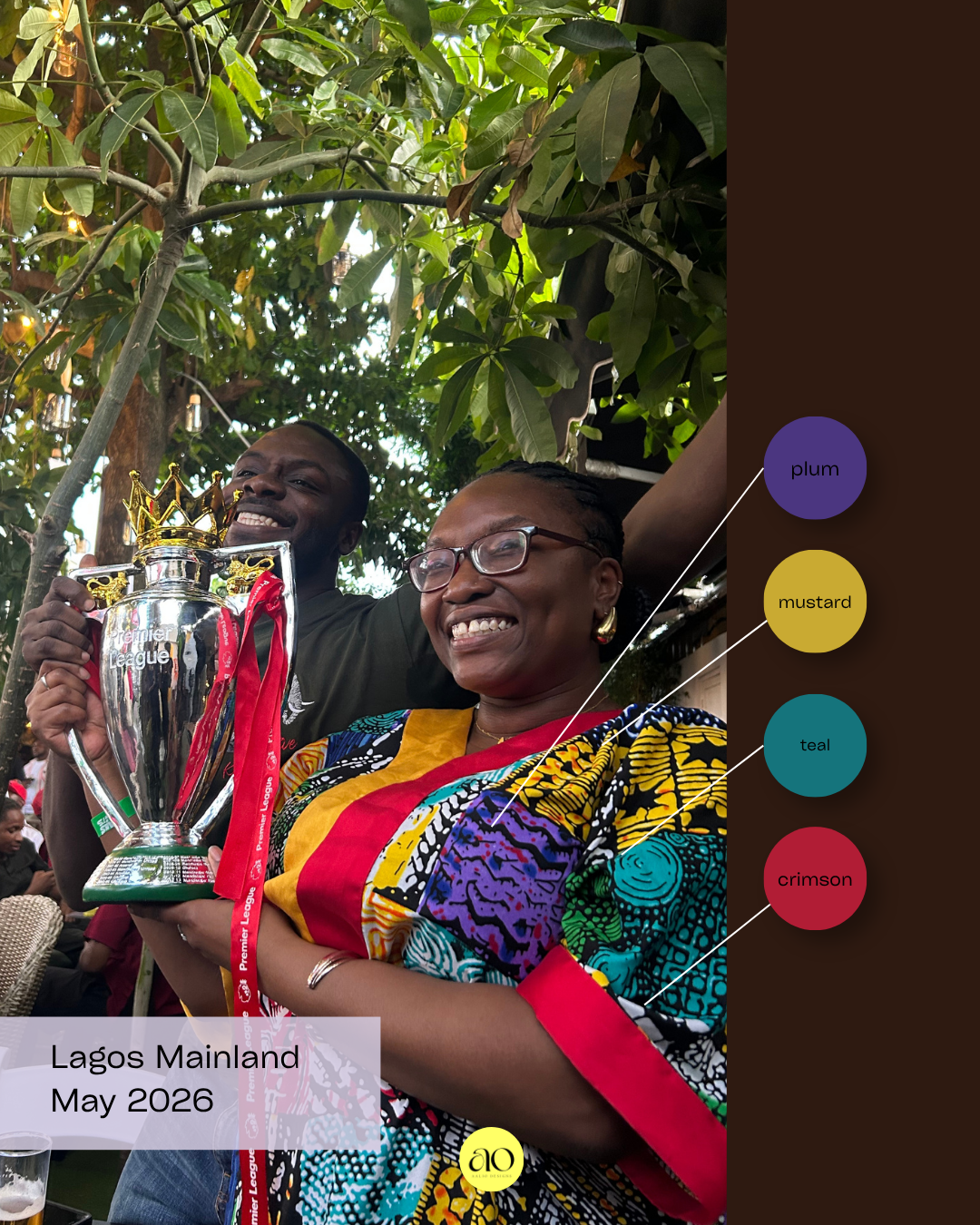
My sister and cousin after finding our Arsenal won the Premier League! A fun moment but more importantly her outfit. Plum, mustard teal and crimson is something in the UK she might have thought of as too loud. But here is felt right, loud, joyful completely at ease. What might feel maximalist in a British context felt like just another day in Lagos.
Grey, green, orange and dark blue
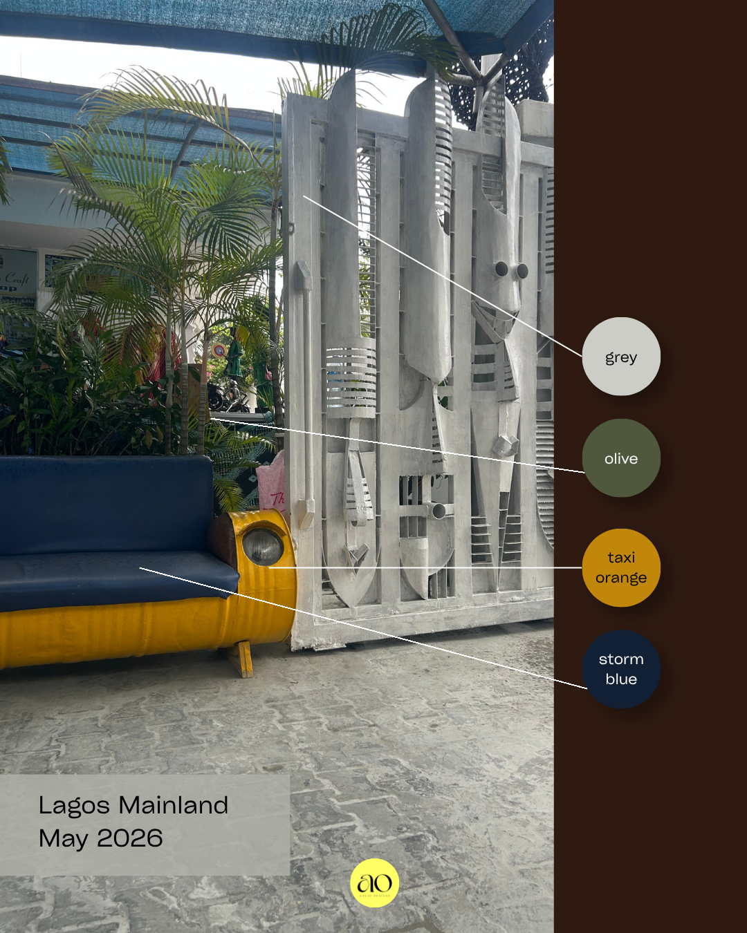
Spotted this vignette outside of the Nike Art Gallery. A taxi yellow sofa sat in front of a raw concrete relief sculpture gate. The combination of the saturated taxi yellow against the deep navy and cool grey just works. In theory I’d think maybe this was too high contrast. However, in actuality this feels unbothered and beautiful.
For the diaspora
I think it’s so important as a designer and a creative to travel and explore if you have the means. The more you travel the more you learn, and it strengthens your own design practice and makes you consider things that you never even considered before there were so many colour combinations and patterns that I really love and enjoyed.
For those of us in the diaspora British Nigerians, Black British, Black Caribbean, African American, anyone who has grown up between cultures I think there's something really important about letting our homes reflect who we are. All of who we are.
I think it can be easy to aesthetically assimilate. To make our homes look exactly like what you’ve seen in an English or American home you saw on Pinterest, which is largely very neutral and 50 shades of beige. I of course think a layered beige space can be lovely. However, again, this is in defense of colour!
I think it’s so important for us in our spaces to honour our cultures and have our homes reflect that. I feel that for many, we want our homes to be reflective of our cultural identity. I believe adding colour and adding patterns and prints is a very good way of doing this. This could be done by purchasing art from your homeland or purchasing art by Black people across the world as well as you can do small things like trinkets, bric-a-brac, throws, cushions, all very easy ways to add that into your space.
Notes on Oyo kidnapping
Before I close, I want to use this space to raise awareness. While I was in Lagos and since returning, there has been deeply disturbing news coming out of Oyo State. In recent weeks there have been reports of kidnappings targeting communities in the region specifically targeting children. This is something that deserves far more attention than it is getting in Western media.
If you have family in Nigeria or want to stay informed, I'd encourage you to follow Peoples Gazette Nigeria and Premium Times Nigeria for on-the-ground reporting.
Nigeria is a country of immense beauty, creativity and warmth the Lagos I experienced and wrote about above is real. And the people there and throughout Nigeria deserve safety and the world's attention.
If you want to explore more:
The Africa Centre — London, celebrating African arts and culture
Afropolis — African design and interiors inspiration
Omenka Gallery — Nigerian contemporary art
ArtNaija — Nigerian art platform